Archive for the ‘Coverage Maps’ Category

Geograph Images + Google Maps + Geocubes

Sunday, December 6th, 2009

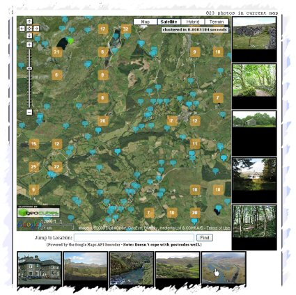
Geograph Images as you Drag - Screenshot
Quite pleased with the latest update to the Geograph Clusters Map. This displays all geograph images on a interactive draggable Google Map. The clustering is powered by Geocubes :) .

However the most exciting part of the update, is the ‘Enable Photo Display’ button. Which once clicked, enables loading a selection of thumbnails as you drag and move the map. Zoom in close enough to see many blue pins for best effect. As you move again, more images will load; the ones shown should always be within the current map view. The data to show images again comes from the Geocubes API, although we load actual thumbnails via our own API.
Where in British Isles are people viewing photos?

Friday, April 24th, 2009

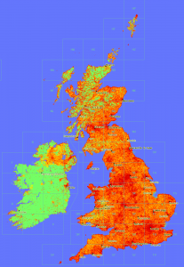
view-depth1-9
In a similar vain to the maps produced here, now that Geograph British Isles has a view counter for each and every photo, we can plot maps of viewing. :)

This map is obviouslly heavily influenced by where photos have actully been submitted; s for comparison here is a depth map of photo submissions.

Don’t know what it means, or if actully useful, but sure is pretty!


(click the thumbnail to see 1px per km scale version)

Geograph: Watching the Fire build

Wednesday, August 13th, 2008

Coverage Animation As we near the Million mark on photos uploaded to Geograph British Isles, the coverage is really building up; and the project has definitly matured from just capturing a photo of every square (but that is still continuing!), to capturing each square in ‘depth’. We display the current coverage on the site as a depth map, but here we present some animations to watch the progress.

There are a number of interesting artefacts in this, if you are quick you can follow people as the hike long distance paths, but you can also see the people making concerted efforts to knock of hectads.

Of course the raw frames are available under Creative Commons, and a bonus prize to who can make an good mashup of these. The animations include both weekly frames, and monthly versions (labelled quick)

(the fire reference)

Depth Key

Where in the world are people looking? part 2

Saturday, March 1st, 2008

Following part 1 yesterday, have now plotted some maps per individual service.

Flash Earth Layer

Conclusions

  1. Google Earth does request a link for the initial view on startup – that point in the Atlantic.
  2. I guess North American installs have two slightly different default placemarks; has it changed, or maybe Canada gets a different one?
  3. But that doesnt explain the lines from there – people must have their links set to periodically refresh?
  4. Germany likes FlashEarth (or rather people like looking at Germany with FlashEarth link enabled)
  5. Many people leave the links open even when not in use – e.g. the British Isles links show worldwide usage, notably over Russia.
  6. MGRS notably has high usage in two areas.
  7. The Far east likes to know what direction they facing.

Update: In a total forehead slapping momont realised these unprojected whole world images, are exactly what is used in GroundOverlays, so the the pages now include links to view the higher resolution images directly in Google Earth, duh!

Example: View In Google Earth (don’t forget to try adjusting the tranparency slider!) [Update, to fix broken link, sorry!]