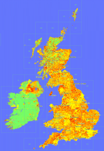
One of the things we been looking recently on Geograph, is guageing how ‘recent’ our coverage actually is. We impose no restriction on when photos where taken – because historical images are useful – not to mention every photo is historic by definition as soon as its taken!

Anyway the point of this post is in the process decided to try plotting a map showing the ‘age’ of the latest photo in a square – to see that recentness. The result is here:
OMG, quite aside from what it shows, it looks beautiful. (To my untrained eye!)
Click the image for a glorious 1px per km version.
© Copyright 2009 Geograph Project and licensed for reuse under this Creative Commons Licence. (if you want to do anything with it!)
Key: Age less than in years: (0 means no photos yet)

There is also a whole series of rendered maps from the project.
