UPDATE: JULY 2010, petition: Google Earth should make the sea floor rendering optional
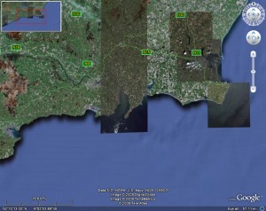
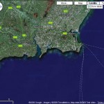
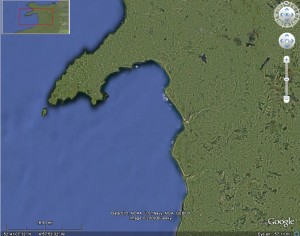
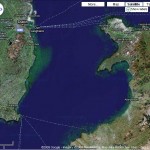
Frank, just alerted me to the new rendering Google have released for Google Earth of the Ocean Floor. Strangely I keep wanting to shout FAIL! Sure at the broadest sense – viewing the globe as a whole it looks quite nice, if a little fuzzy, but once start zooming into coastline, the matching is just a mess. The new lighter blue just sort of fades out the old darker blue. Have to say even Frank doesn’t seem convinced…
Admittedly I not really into ocean travel so the probably higher resolution doesn’t really interest me, so that puts it at a disadvantage from my point of view. Hopefully they can vastly improve the edge matching, aka the coastline, then I wont mind.
Ok so it wasn’t perfect before, having a greenish area – but it just looks like algae. But the new doesn’t look natural somehow.
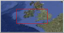
Another issue (oh dear), is the new lighter blue around the UK, is a closer to shade of land. And in the overview map – example below, I can’t even see Wales, and most of England and France etc is pretty indistinct – making the overview map fairly worthless. (disclaimer: I am red/green colour blind)
Overall: E- (sorry)
Tags: omg

http://code.google.com/p/gmaps-api-issues/issues/detail?id=1022
[...] back when, I wrote a rather scathing review of the then new “sea floor” imagery. This takes the form of a rendering supposed to [...]